How to Draw Graffiti Letters
Short answer
Learning how to draw graffiti letters comes down to order: skeleton first, style second, outline and shadow third, color last. Start with a short word in plain capitals, fix the bar structure, then bend it into one style — and practice each round in an editor that renders your exact letters instead of redrawing from scratch.
By GraffForge Editorial TeamUpdated October 10, 2026
Start with a short word in plain capitals — four to eight letters read best.
Build the skeleton first: equal-width bars before any style.
Push the skeleton into one style instead of mixing several.
Outline and shadow come before color, never after.
Practice every round in the editor, then take it to paper.
Five steps, one direction.
This is the workflow behind most graffiti letters, compressed into steps you can repeat with any word. Knowing how to draw graffiti letters is mostly knowing what to fix first — structure survives a bad color, but no color saves a broken skeleton.
Practice in the graffiti editor- 01Write your word in plain block capitals and count the letters. Short words leave room for the shapes that make graffiti letters feel alive.
- 02Replace curves with bars. Equal-width stems, crossbars, and consistent spacing form the skeleton that every style hangs on — fix proportions here, not later.
- 03Push the skeleton toward one style: round the joints for Bubble, keep them square for Block, overlap the strokes for Wildstyle. One direction per piece.
- 04Add a clean outline around every letter, then a drop shadow in a contrasting color. This pair is what lifts the letters off the wall.
- 05Fill with color last, squint-test the readability at small size, and export a 2048px transparent PNG so the design survives any background.
Skeleton first, style second.
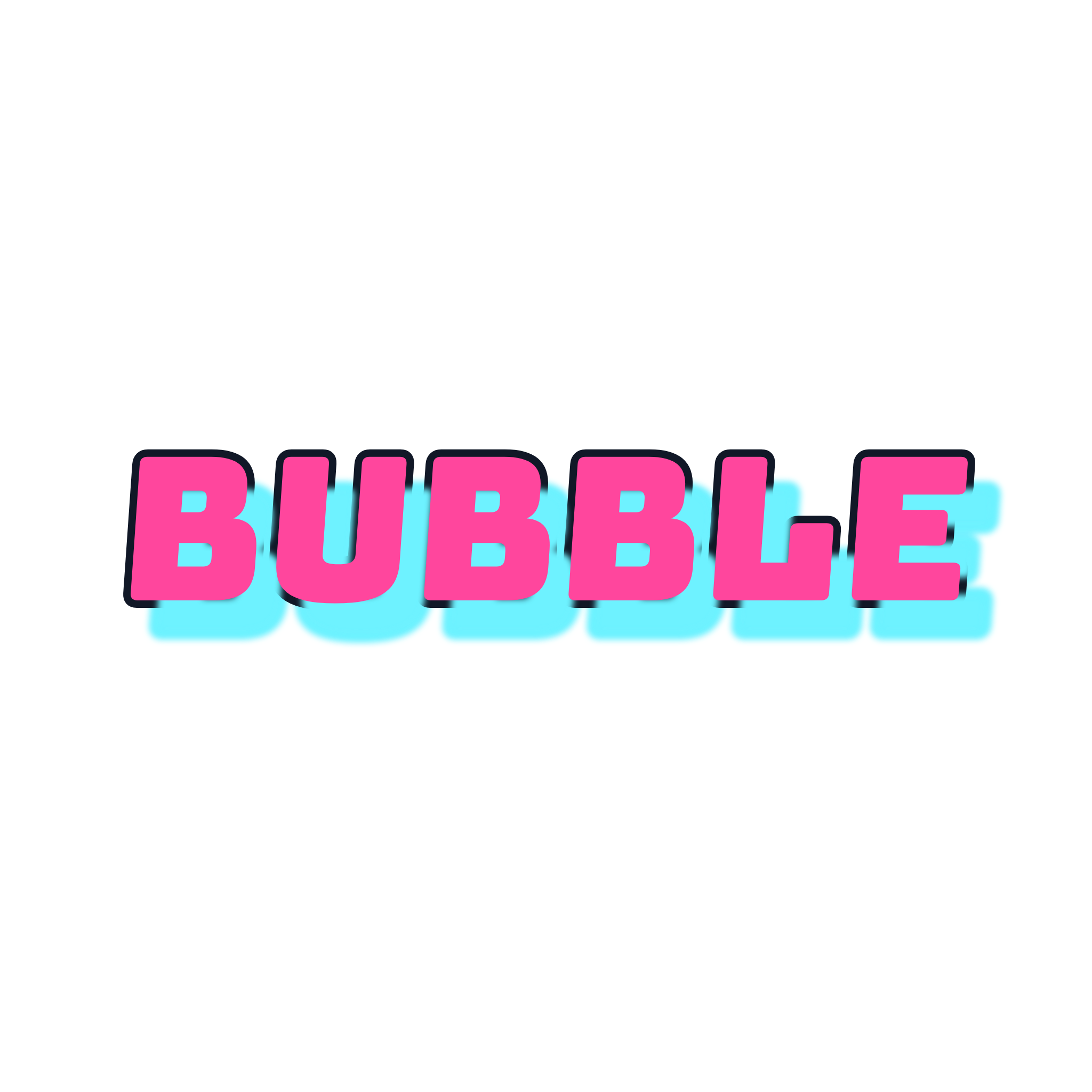
The most common beginner error is decorating before structuring. When you draw graffiti letters, the bar skeleton decides whether the word reads; style only decides how it feels — which is why serious lessons on how to draw graffiti letters always start with bars, not colors. The render below is a Bubble preset output from the editor — rounded joints, even weight, exact spelling — the same structure you would aim for by hand before adding drip or shine.
What a browser tool cannot teach
- Can control, wrist flow, and paint behavior come from practice on paper or walls — an editor removes them, not replaces them.
- Presets apply one style consistently; developing your own letterforms still happens off-screen.
- Instant, exact iteration is the editor's real teaching value: you see how structure, outline, and shadow interact without redrawing the word each time.
Keep the path clear
You now know how to draw graffiti letters end to end. Every route out of this guide ends in a working tool: render the word you just sketched, compare it across all twelve styles, or settle the tag-versus-throw-up question for your next piece.