Graffiti Letters Maker: Draw or Generate
Learn how a graffiti letters maker builds letterforms: bars, counters, letters that break, and when to draw them by hand or generate the exact word free.
People search for a graffiti letters maker when they already have a word and want the letters themselves: the bars, the holes inside them, and shapes that still read beside their neighbors. Not a font file, and not a list of names. Our graffiti fonts guide names the twelve style families, and the graffiti tag names guide helps you choose what to write. This page starts after the word exists.
A graffiti letters maker is either your hand or a generator that rebuilds the letterforms from the exact characters you typed. Both fail in the same places. An M collapses into its neighbor. A counter fills shut. A thin I disappears beside a fat O. The rest of this guide is how to see those failures before they are painted, how a style changes a letter without changing the spelling, and where to make the letters free once the structure holds.
What a graffiti letter is made of
Every graffiti letter hangs on the same parts, however wild it looks later.
Bars. The stems, arms, and crossbars. In a readable word they share one width. A bar that thins in the middle, or swells only on the letters you like, makes the word look unfinished even when the colors are right. Block letters are the clearest place to see this, because nothing else is competing with the structure.
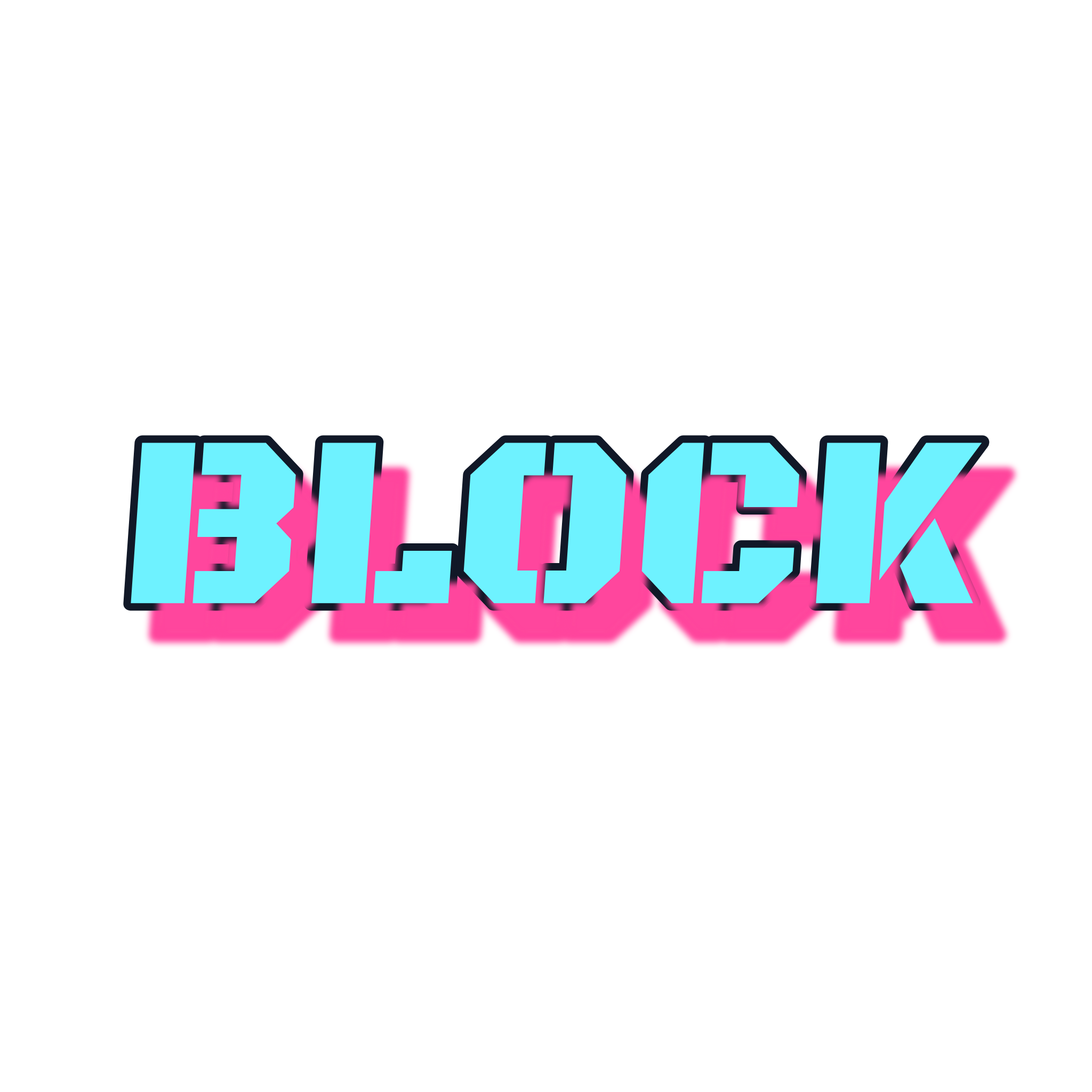
Look at BLOCK. The B has two counters, the O has one, and the C keeps that same bar weight with the right side open. The dark line is an outline around the bars. The pink shape is those letters shifted back, an offset shadow. Width, holes, and the gaps are doing the work.
Counters. The holes: the inside of O, the bowls of B, the triangle of A, the upper bowl of R. Close a counter and the letter becomes a blob. A thick outline eats the hole. So does an overlap that covers it.
Spacing. Letters in one word share a baseline and a height. Judge the gap by the area between them, not by the closest points. A diagonal (A, K, V, W) leaves a wider hole beside a vertical than two verticals leave beside each other. Space those pairs by the nearest ink and they look detached from the word.
Connections. A touch can be a shared bar, a small overlap, or nothing. Cover the overlap with a finger. If the spelling changes, the connection is doing too much.
The hand sequence that builds these parts in order — skeleton, then one style, then outline and shadow, then color — is the guide on how to draw graffiti letters. What follows is the part that sequence assumes you can already see: which letters will fight the word they are in.
Letters that hold, and letters that fall apart
An alphabet chart shows each character alone. The graffiti alphabet renders A to Z in all twelve styles for that. Study a letter there, then put it back between its neighbors. Alone, it never shows the collision.
Open rounds: C, G, O, Q, S, U. These need air. A heavy outline turns O and Q into dots. C, G, S, and U are letters only while the opening stays open. Close it, or let a neighbor lean across it, and C becomes O. Bubble style is the stress test, because every joint wants to be a circle.
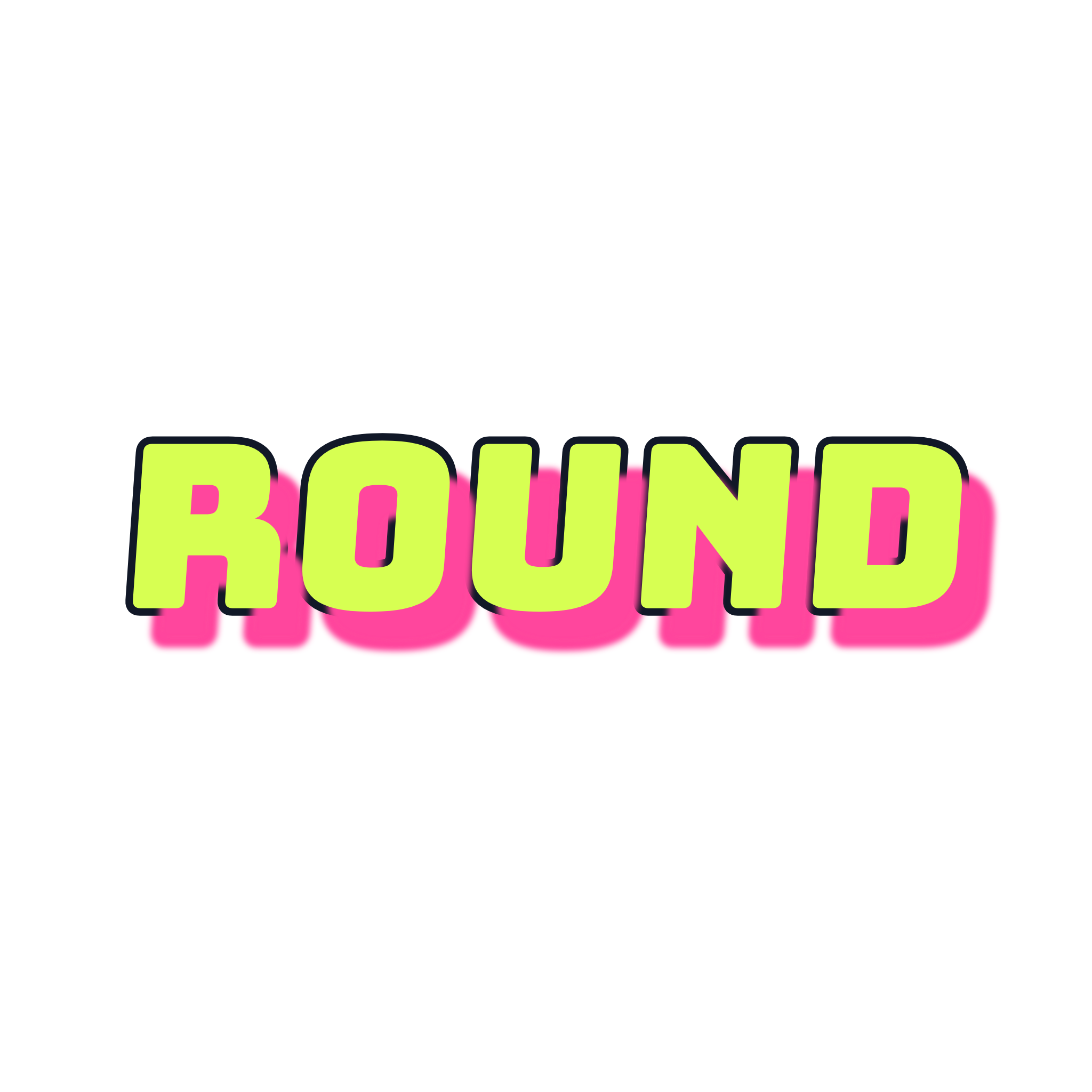
ROUND is a clean test. R opens toward O, O keeps a counter, U stays open at the top, and D closes. The rounded joints change the corner where two bars meet, not the spelling. If your word has an S or a G, try a round style first. The letter survived if the opening still reads from across the room.
Diagonals: A, K, M, N, V, W, X, Y, Z. M and W are the usual collapse: four strokes in the width of one letter. K and R kick the next letter. X and Y want to be one gesture, which works in a tag and knots up in a heavy piece.
Draw M and W a little wider than their neighbors, and keep the outer strokes from leaning across the gap. A word that is mostly diagonals — WAVE, MIX, SKY — should stay in a simple style. There is no spare room for extra cuts.
Closed counters and lookalikes: B, D, P, R, 8, 0, O. B, P, and R match until the lower half, and a heavy style clogs the leg of R and the lower bowl of B first. 0 and O are the same shape unless you slash the zero or change its width. Decide that on purpose if the word uses both. 8 is two stacked counters. Close either and it reads as B, or as a stain.
Thin letters: I, J, L, T, 1. A single stroke between two fat letters vanishes. Give I and 1 the same bar width as the others, or a top and a foot the eye can catch. L needs a foot, or it reads as I. T needs a crossbar wider than its stem.
Breaks through a bar. Stencil cuts a stroke so a closed counter can be sprayed through a sheet without the island falling out. The cut has to land where the letter still reads.
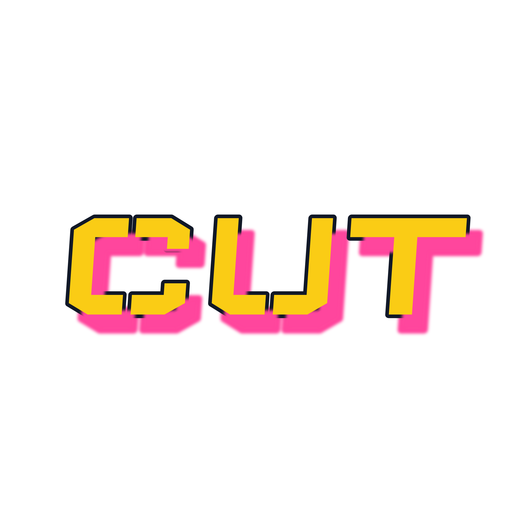
CUT keeps three simple letters obvious because the breaks are consistent and none of them removes the opening that makes C different from O. A break through the only stroke of an I destroys it. A break through a wide bar, in the same place on every letter, is a style.
One spelling, more than one letterform
Style does not replace the letter. It chooses the joint and the counter.
Block keeps the joint square and the counter large. Use it when a stranger has to read the word. Bubble rounds the joint and inflates the bar. It stays readable, and it punishes small counters. A sliced or overlapping style spends the counter on energy. WILD can survive that. MINIMUM usually cannot, because almost every stroke is already a thin diagonal.
You need two styles of the same spelling to see this, not all twelve. If the plain one reads and the loud one does not, the letters were fine. The style spent structure the word did not have. The twelve families, and when each one is the wrong tool, are in the graffiti fonts guide linked above.
Draw the letters, or generate them
Drawing and generating teach different halves of the same letter.
Draw when you want a hand that is yours. Paper, a sketchbook, a legal wall, your own project. An editor will not give you wrist control, and it should not pretend to. Match the bars twice, then push one style. Keep the practice off anyone else's property. The draw guide linked above is the step order.
Generate when the spelling has to stay exact, the weight has to stay even, and you need a file today. A graffiti letters maker in the browser rebuilds every letter from the characters you typed, so the spacing belongs to that word instead of to a font file drawn around a different one.
The free graffiti letters maker is the short path:
- Type the word. One to twenty characters, and at most one space. Latin letters, digits, and
. , ' ! ? & + -are accepted. The letters on the page are your spelling. - Compare styles on that spelling. All twelve presets preview live. Check the counters and the thin letters before the palette. A closed hole is still closed in a better color.
- Export the PNG. Download at 2048 pixels, on a solid background or a transparent one, with no watermark and no account.
When the job is a readable title and you want that comparison as the whole page, the graffiti font generator is the same exact-text engine. Personal names fit the letters maker as they are. If you are still choosing the word, use the tag names guide first, then test the finalists here. A name that collapses its M is a letter problem, not a naming problem.
Shortcuts that do not make letters
Copy-and-paste symbols. Those pages swap your characters for lookalike Unicode. There is no bar width and no counter, and the string breaks in a screen reader or a search box.
A downloaded font file. A font repeats one frozen drawing of each character. The R does not know it sits next to your M. A maker rebuilds the word. Many of those files are personal-use only, which matters as soon as the letters go on something you sell.
An image model told to add text. It can paint a wall. It is unreliable at spelling. Preset text keeps the characters you entered. Freeform AI lettering does not, and those scenes follow a different usage rule. If the letters are the point, make the letters first.
The license page is the source of truth for what you can do with an export. It clears PNG files from the free Font, Tag, and Online tools for personal or commercial projects, and it does not give you the font files themselves. AI scenes follow the account: Free and Standard are for personal use, and Premium adds commercial rights. Neither path is permission to imitate a protected brand, artist, or person.
FAQ
What is a graffiti letters maker? A way to turn one word into graffiti letterforms, either by drawing until the bars match or by generating them from the characters you type. Counters, bar width, and thin letters are what you judge in both.
Which letters should I fix first? M, W, K, and R, then any closed counter that clogged, then any I, L, or T that disappeared. Fix width and holes before the outline. A broken bar gets more expensive once the outline has to be redrawn with it.
How many letters can I generate at once? The graffiti letters maker accepts 1 to 20 characters and at most one space. Four to eight letters leave room for counters to stay open in a heavy style. A two-word phrase with one space fits. A sentence does not, and it would not read as letters anyway.
Do I have to draw the whole alphabet first? No. Learn the letters that are in the word. Open the alphabet reference when one character keeps failing and you want it alone, in a simpler style, before it goes back. A sketchbook trains a hand. It is not a fee due before the first word.
Can I put the letters on a shirt or a poster? Read the license for the tool you exported from. Font, Tag, and Online PNG exports are cleared there for personal or commercial projects. A file from another site follows that site's terms. Someone else's name, logo, or tag does not become yours because a tool rendered it.
Make the letters in the word you have
Write the word in plain capitals. Mark the diagonals, the closed counters, and the thin strokes. Then open the graffiti letters maker, type that word, and compare a plain style with a louder one before you touch the colors. If both read, you have letters. If only the plain one reads, you learned something about the word, which is the useful result either way.